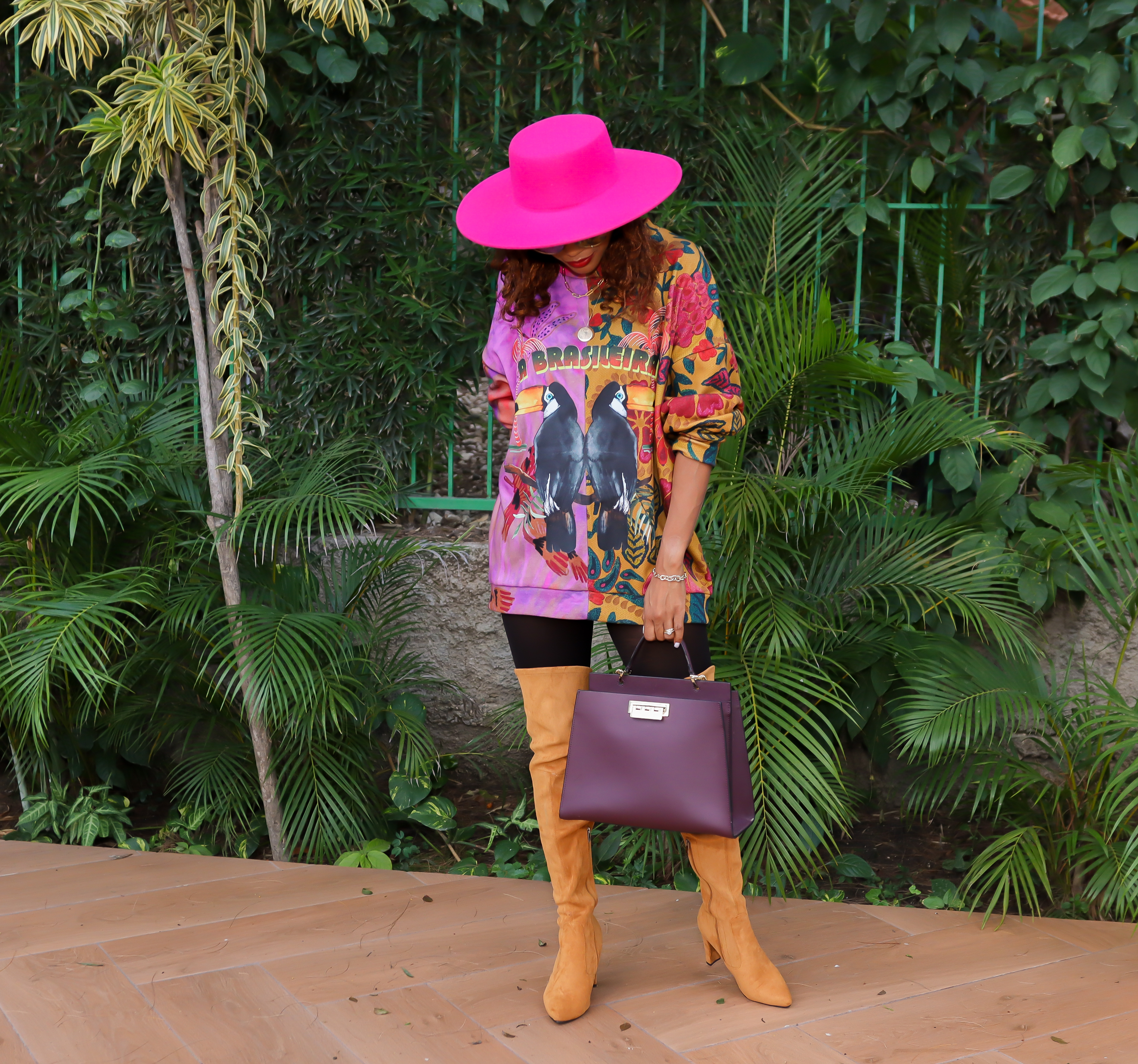
Hi everyone,
A fun topic for today. I noticed some interesting colors on the runway this fall and I thought of sharing them with you. Of late, I have been focusing on the meaning of colors a lot as I believe that some colors have the power to transform any boring outfit into something very dramatic or just uplift your mood. Of course, autumn’s go-to shades are in the mix this year, but I’m also seeing vibrant, joyful shades of bright yellows and greens, fierce fuchsia, dreamy blues, and so much more. So, to help you get your Holidays wardrobe ready, I’ve rounded up the biggest colors debuted during FW21 so you can enter the coming season truly wearing the rainbow :-).
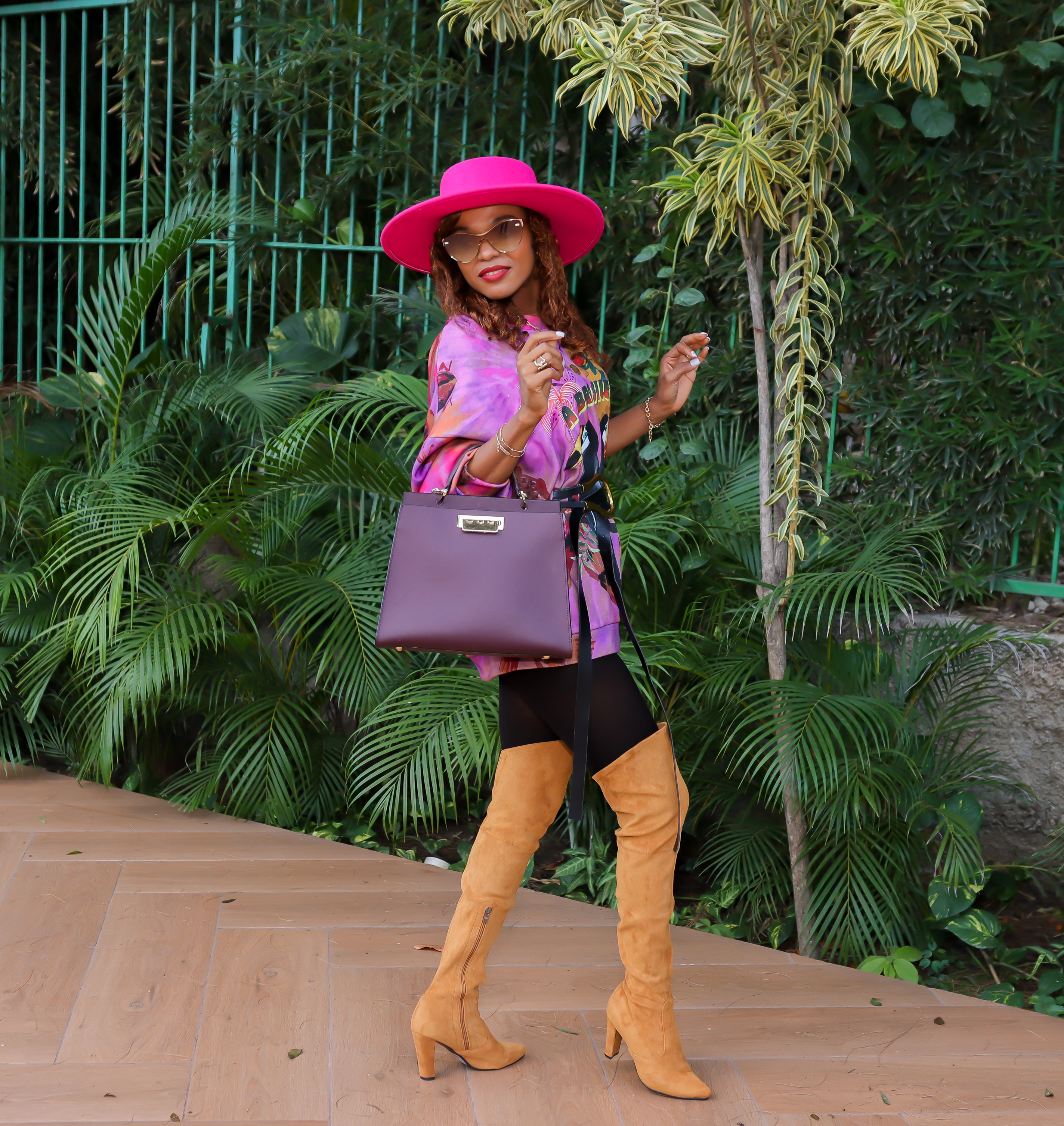
1. Olive Branch
A tasteful green symbolic of growth. Olive is a fall mainstay and we love it for its ability to go with practically everything, whether you pair it with other various green shades, a muted red, or even vibrant neon hues as pictured above.
2. Mykonos Blue
A brisk blue evocative of the Aegean Sea. I think making a monochromatic outfit showcasing other blue hues (think navy, indigo, Aegean, and denim) is a lovely way to show off this bright color.
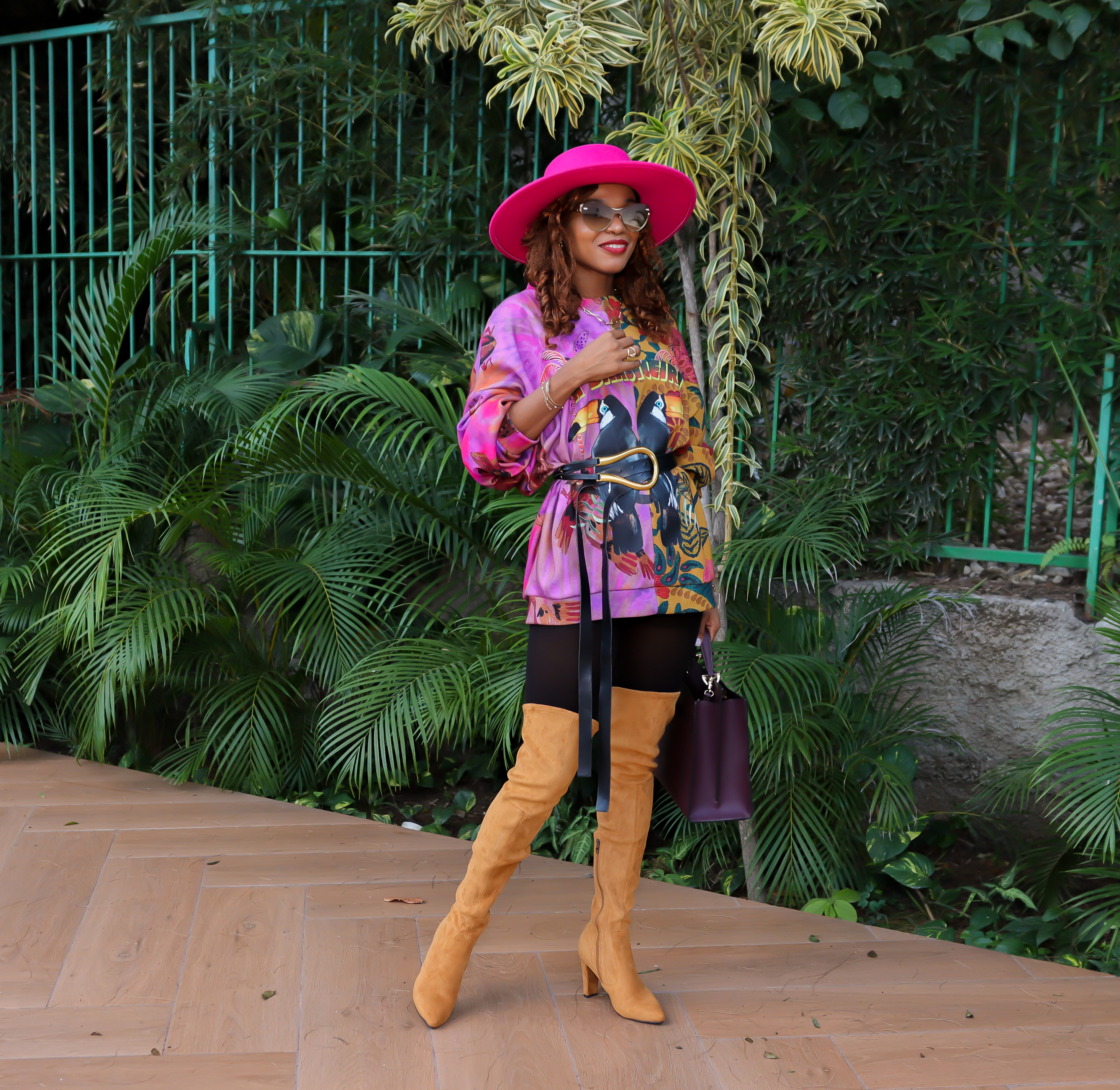
3. Illuminating Yellow
Friendly and joyful, an optimistic yellow offering the promise of a sunny day. Light grays and muted browns and nudes all complement this happy shade, making it a wonderful addition to your Autumn mix.
4. Leprechaun Green
Leprechaun is a wondrous green hue emblematic of the mythical imps featured in Irish folklore. This shade of green has been trending for a while now. Zara had some great options earlier this year and I am not sure why I went for an illuminating yellow blazer instead.
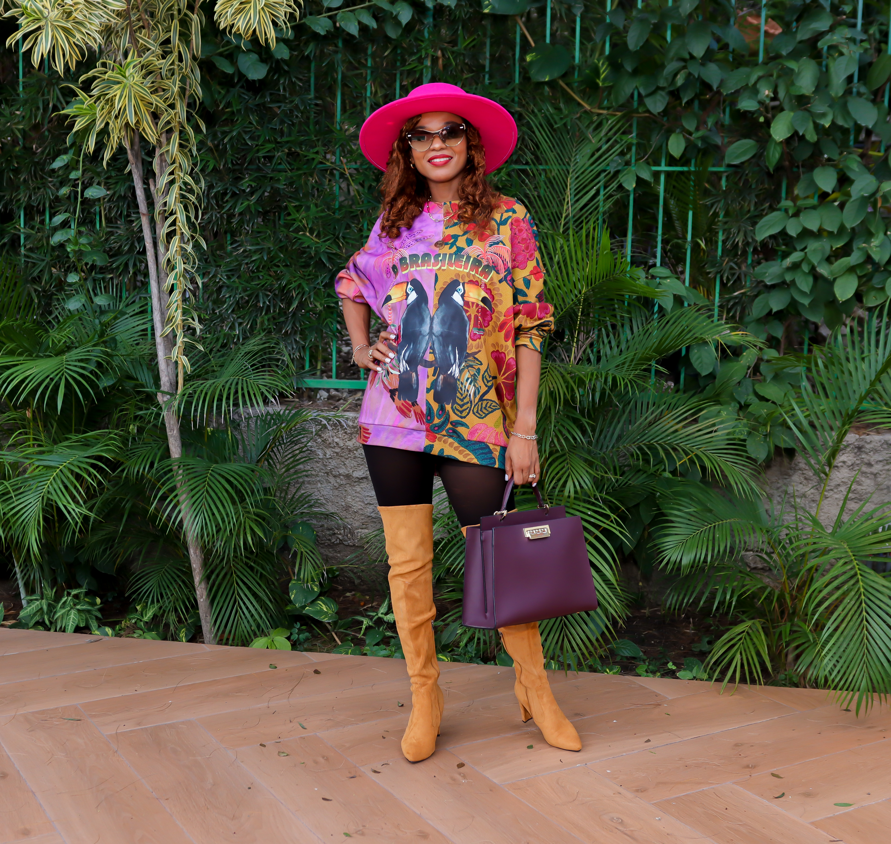
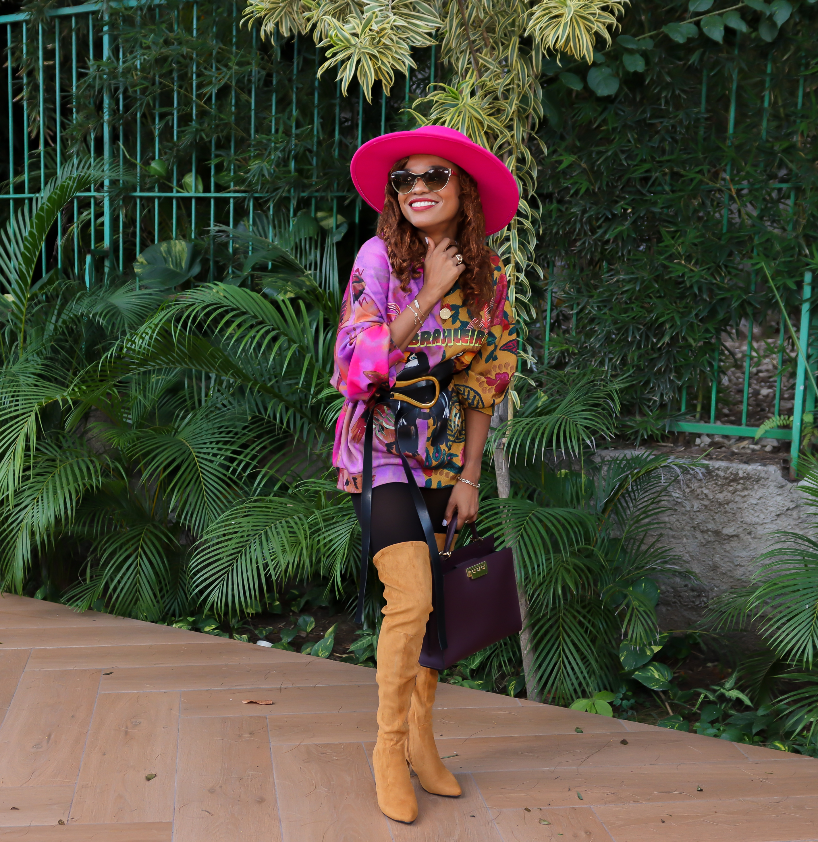
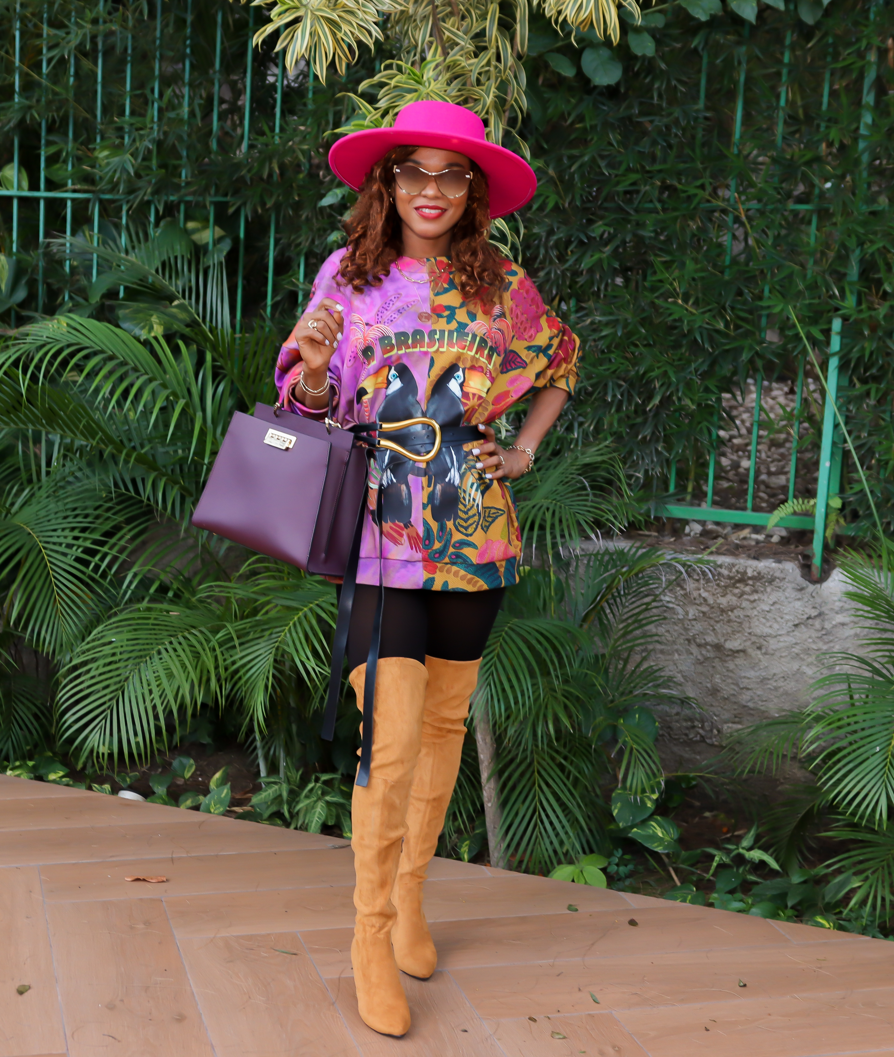
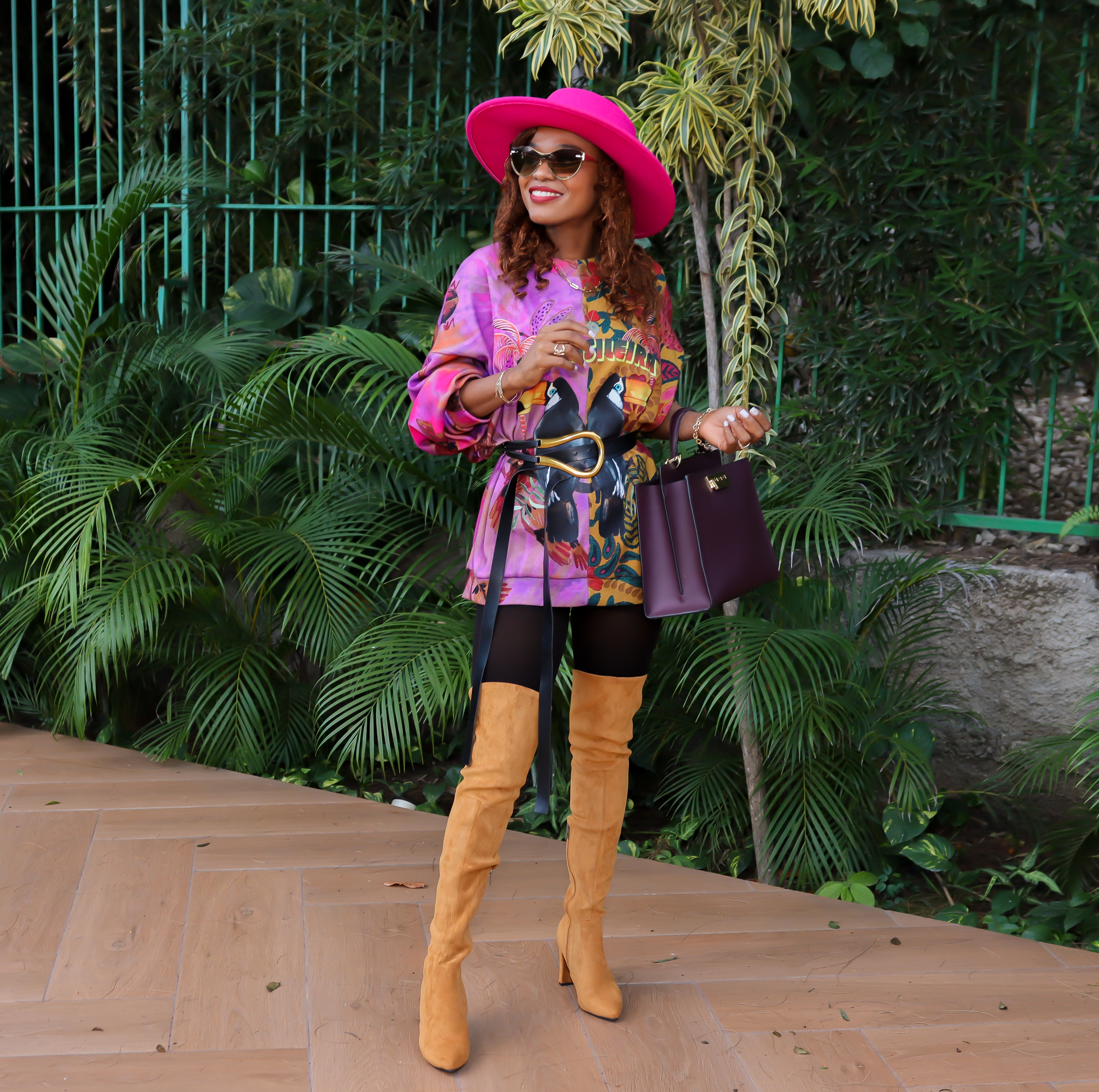
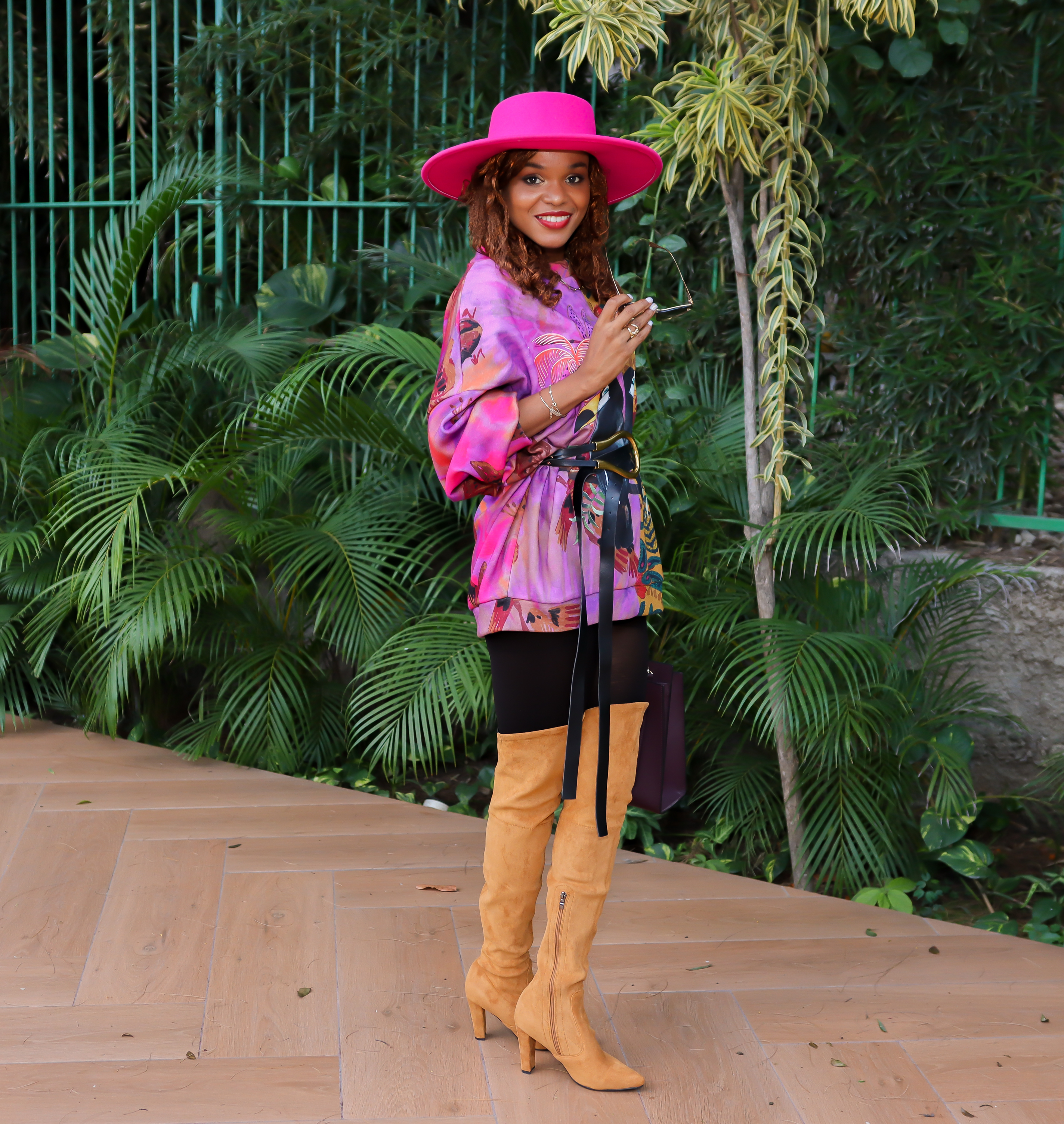
5. Fuchsia Fedora
Vivid Fuchsia Fedora is a flirtatious, bold pink with allure. So what do you think about my interpretation of that Fuchsia Fedora :-)?
6. Fire Whirl
A vigorous red with a dynamic presence. When it comes to fall time shades, red is obvi one that is always going to be in the mix. But while we tend to see more muted tones of this color like warm rust and auburn hues, this classic firetruck tone strays away from the norm.
7. Rhodonite
Rhodonite is a balancing blue-based purple that aids in achieving one’s highest potential. I hope that my clients reading this blog post finally understand why I prefer that shade of blue to black. But here’s a tip, if this shade of navy blue is throwing you off: Just wear it as if it’s black. Yup, that’s it!
8. Soybean
Soybean is a mild and companionable blonde beige. This off-white hue is not only a universally flattering shade, it’s a timeless one. We particularly love it on any type of knit, since it has more depth and can portray texture better than a flat shade of basic white.
9. Root Beer
An herbal brown tone is symbolic of the root bark of the sassafras tree. Sweetly dubbed by Pantone as “Root Beer,” this rich, earthy shade is both autumnally appropriate and so chic. While brown shades can be tricky to pull off, we think this extra cozy hue is ideal for the upcoming season and works seamlessly with all skin tones. Lately, I have been so in love with this shade of brown.
10. Adobe Clay
Adobe is a warm and supportive sundried clay. Interrupting the stream of unusual trending colors to bring you a tried and true fall time go-to’s. This warm, rusty clay hue is one of our absolute favorites. Another one that I am particularly attracted to.
11. Coconut Cream
A thick and rich velvety white. Another more flattering option to the plain pearly white.
12. Ultimate Gray
Quietly assuring and reliable, Ultimate Gray encourages composure. The Colors of the years were also running the show. If you have a warm undertone, you might need to consider the best way to embrace this shade of color as it can easily upset your skin tone.
13. Pale Rosette
An endearing and gentle romantic pink. This one is a tricky one as lilac tends to take over but pink is still leading :-).
14. Spring Lake
A quiet and restful mid-tone blue. Spring Lake blue is almost a neutral that cropped up on many runways. It’s perfect to wear on its own or in combination with nearly any other fall and winter hues.
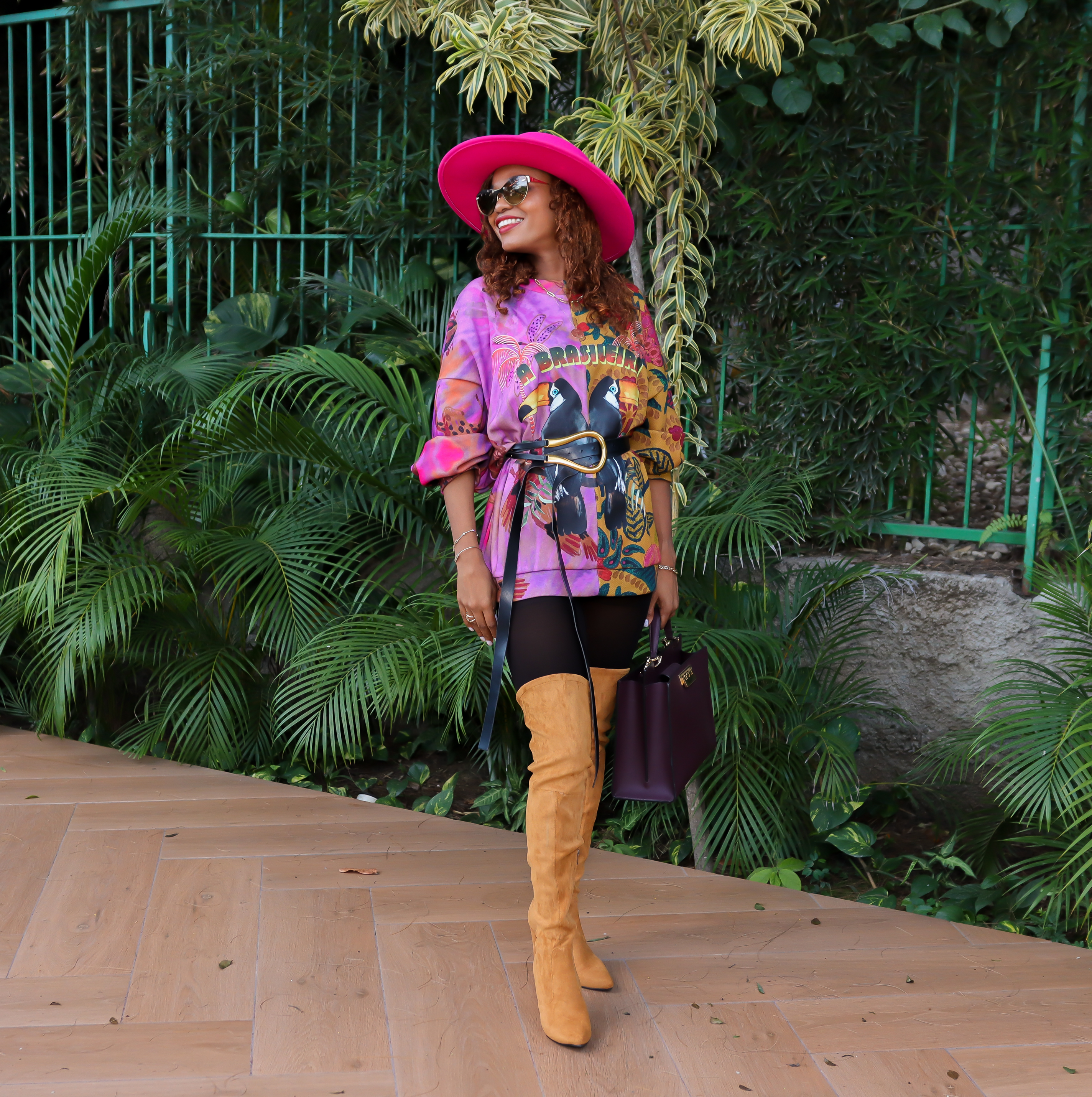
Outfit Details
Sweater @Champagneboutique (here) | Boots (here) | Belt @ThaliaBoutique
Handbag @Luminescence | Sunglasses @BelOptik |
Hair Makeup @jpdistribution
I am definitely enjoying this color palette mostly because of how unique and vibrant the choice of neutrals is this year. According to Pantone Color Institute experts, colors for Autumn/Winter 21/22 New York emphasize our desire for a versatile range of color that embraces and accommodates the various possibilities of our bifurcated lifestyle; colors that encourage personal expression whether sensible or quirky; colors that embrace the calm and healing as well as express a rainbow of hope and joyfulness. How inspiring?
So what are your favorite colors from this palette and most importantly which ones are you actually wearing this season or looking forward to embracing? Take a tour in your closet and see which ones of them you own and what great combo you can come up with. As usual, I can’t wait to read your comments.
Thanks for stopping by.
Xo,

 My name is Iris, and I am a Certified Style Coach™. I am here to assist you in building confidence, enabling you to achieve and consistently enhance the best version of yourself every day.
I love all the bright colours in your top! I really like wearing bright and cheerful colours!
Thanks for joining the #WeekdayWearLinkup! Hope that you had a great weekend 🙂 We had a couple fun Christmas gatherings 🙂
This is a really beautiful colour combination. I love the bright pink fedora! Thanks for linking up!
Emma xxx
http://www.style-splash.com
I just love how you put this look together! Bright colors are so much fun!
Tracy
https://www.findyourdazzle.com