Hi everyone,
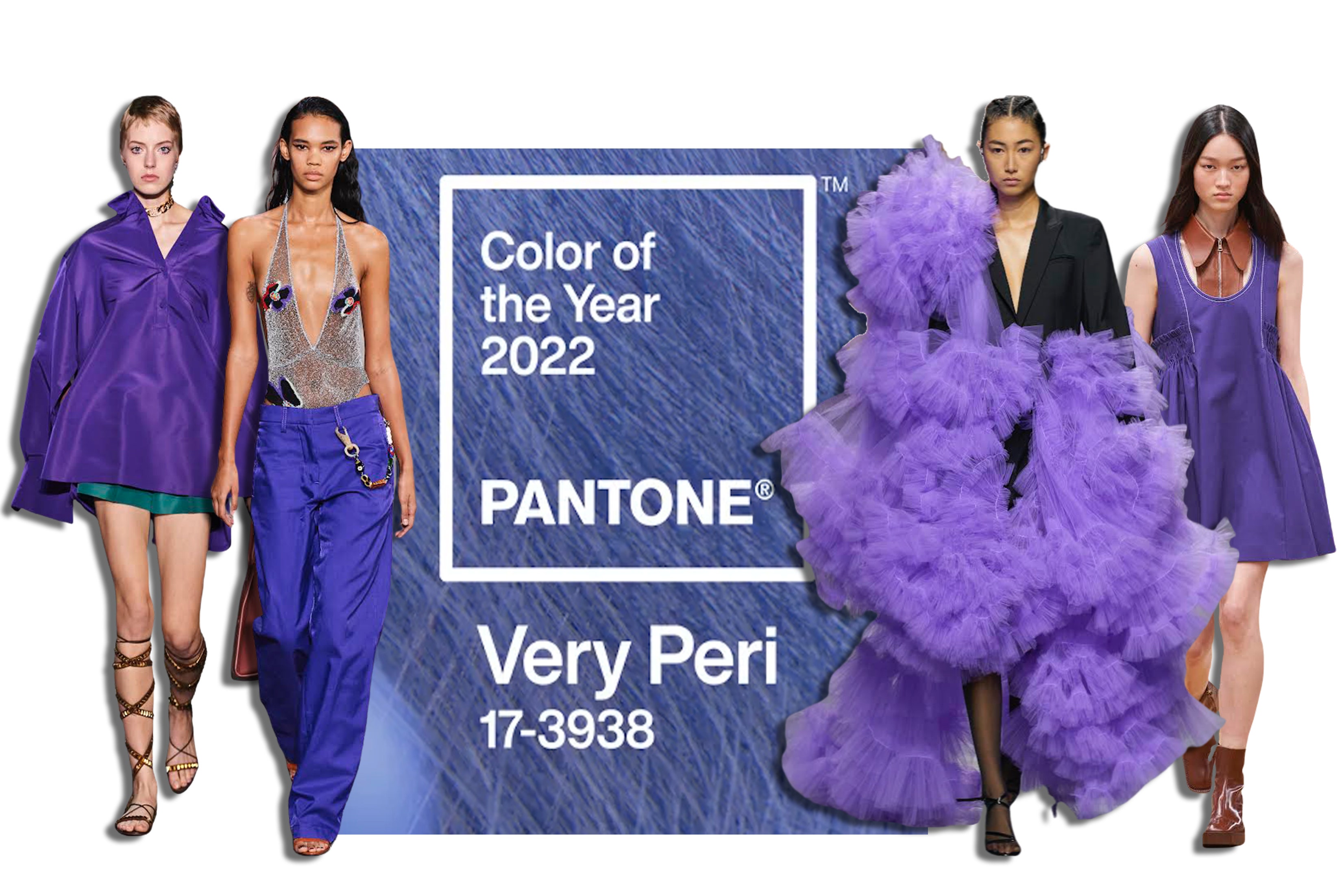
Late last year, they announced the Color Of the Year 2022 “Very Peri”, a New Pantone Color Whose Courageous Presence Encourages Personal Inventiveness And Creativity. Displaying a care-free confidence and a daring curiosity that animates our creative spirit, inquisitive and intriguing PANTONE 17-3938 Very Peri helps us to embrace this altered landscape of possibilities, opening us up to a new vision as we rewrite our lives. Rekindling gratitude for some of the qualities that blue represents complemented by a new perspective that resonates today, PANTONE 17-3938 Very Peri places the future ahead in a new light.
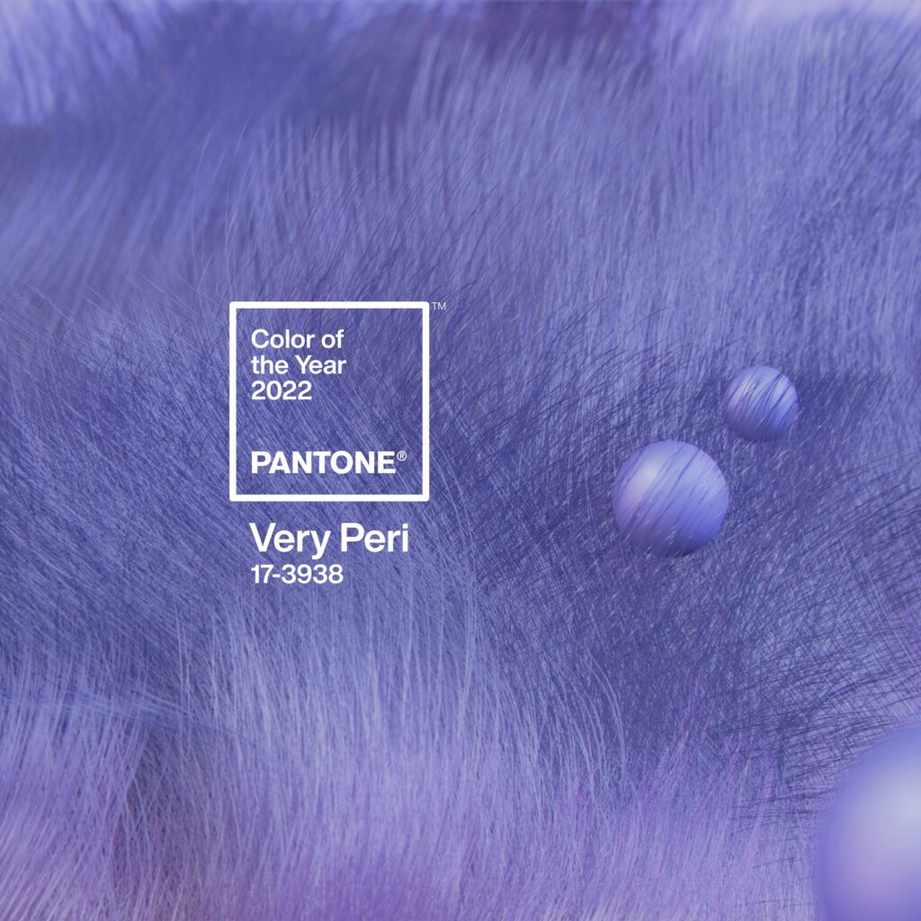
According to Pantone, the color is a dynamic peri(winkle) blue hue with a vivifying violet-red undertone. “The color blends the faithfulness and constancy of blue with the energy and excitement of red,” the social media post read.
Pantone also created 4 color palettes with Very Peri to help us bring this year’s color into our designs or our wardrobe. Each palette conveys a different mood. So do let me know which one is your favorite.
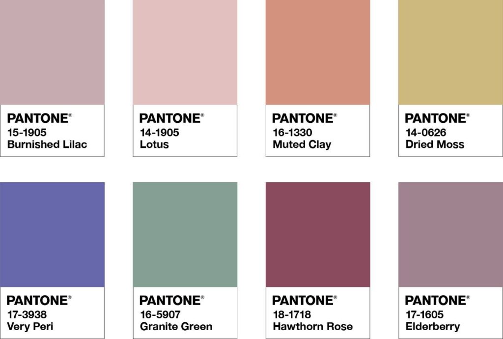
BALANCING ACT
Balancing Act is a complementary palette of color whose natural balance of warm and cool tones supports and enhances one other. The brilliance of PANTONE 17-3938 Very Peri is intensified within this artfully calibrated palette, injecting a feeling of liveliness and visual vibration.
Color Harmonies

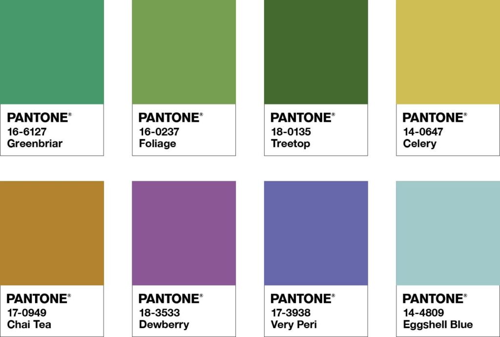
WELLSPRING
A holistic and harmonious blend of nature-infused shades, Wellspring highlights the compatibility of the greens with good-natured PANTONE 17-3938 Very Peri and the health-giving properties of these deliciously subtle and nourishing hues.
Color Harmonies

THE STAR OF THE SHOW
The dynamic presence of PANTONE 17-3938 Very Peri comes through in The Star of the Show, as we surround this happiest and warmest of all the blue hues with a palette of classics and neutrals whose essence of elegance and understated stylishness convey a message of timeless sophistication.
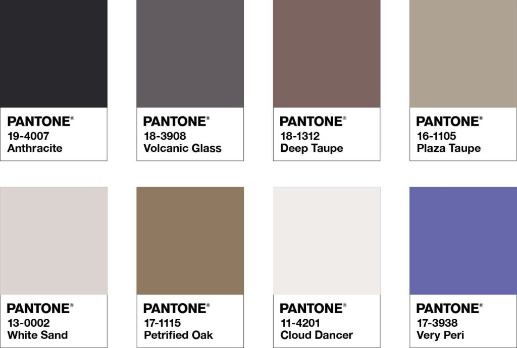
Color Harmonies

AMUSEMENTS
Amusements, a joyous and whimsical color story of irrepressible fun and spontaneity is amplified by the carefree confidence and joyful attitude of PANTONE 17-3938 Very Peri, a twinkling blue hue whose playfulness emboldens uninhibited expression and experimentation.
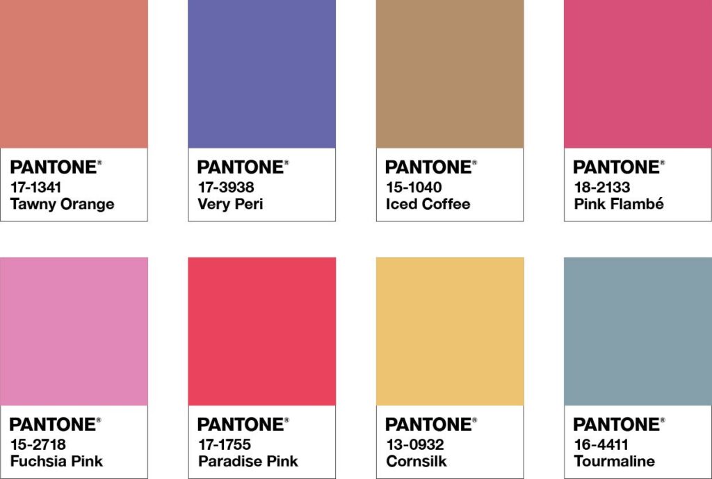
Color Harmonies

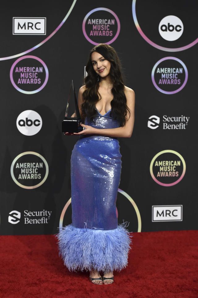
Very Peri On the Red Carpet
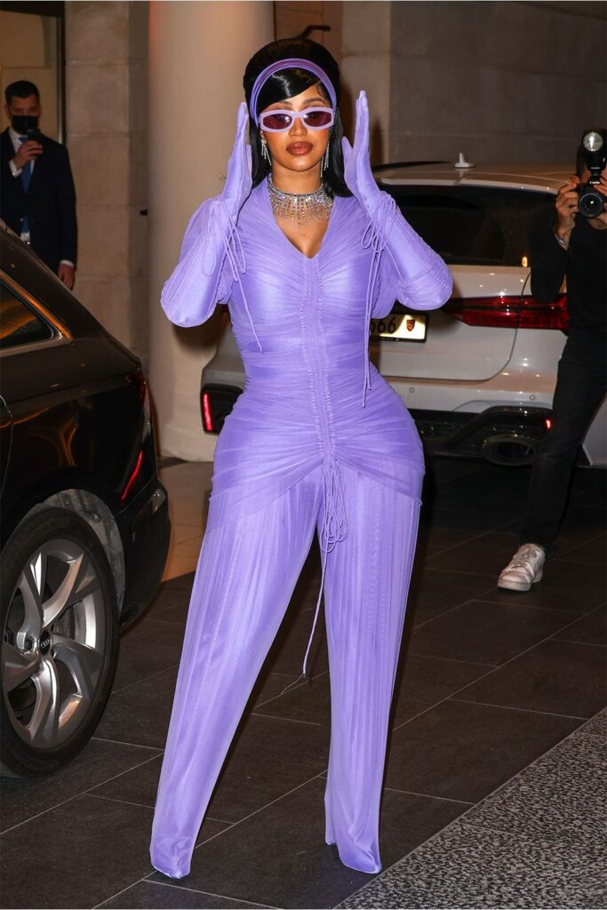
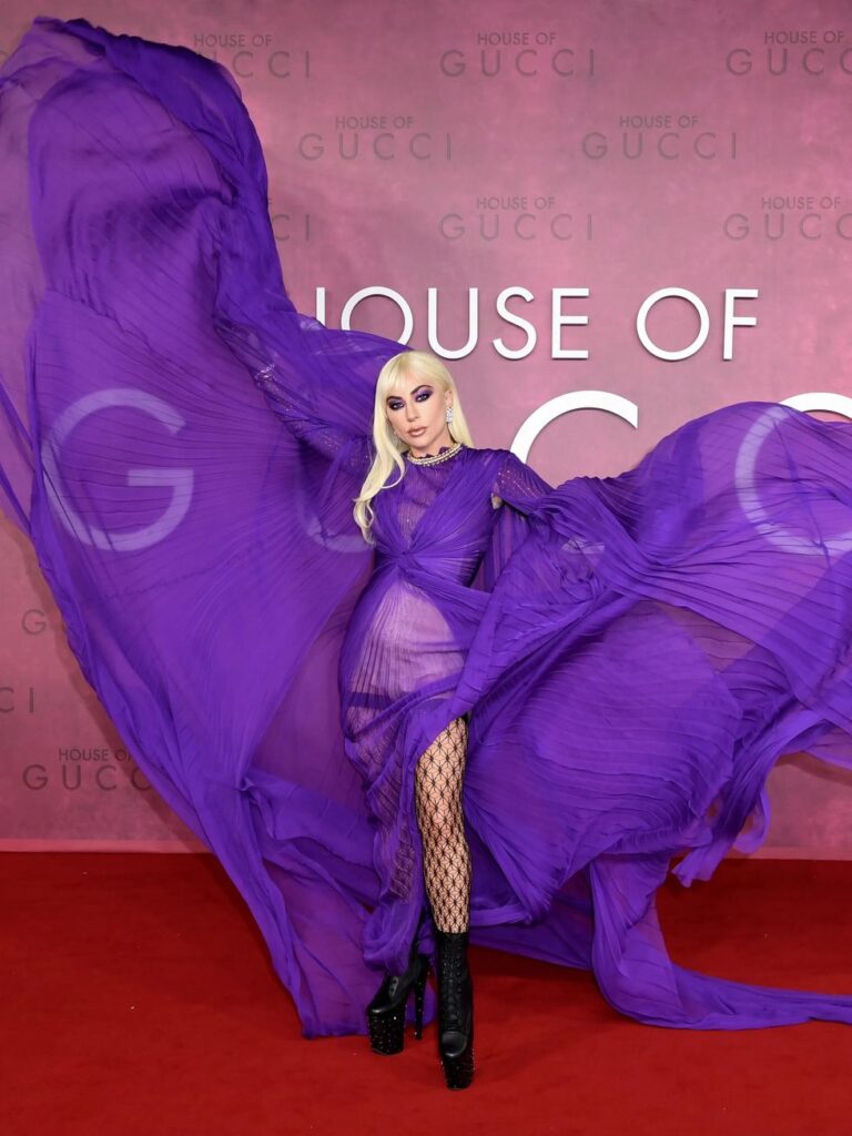
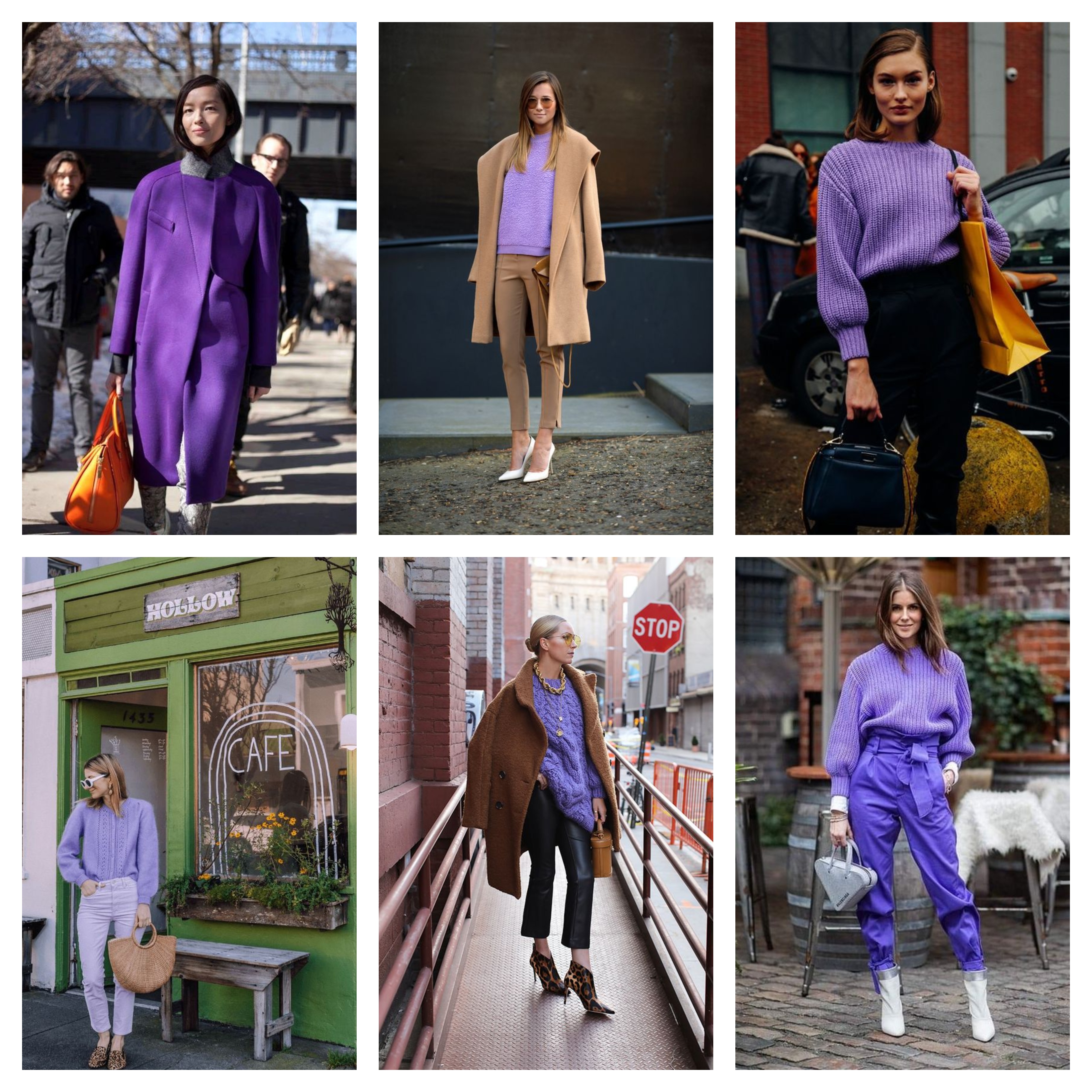
Very Pery & Street Style
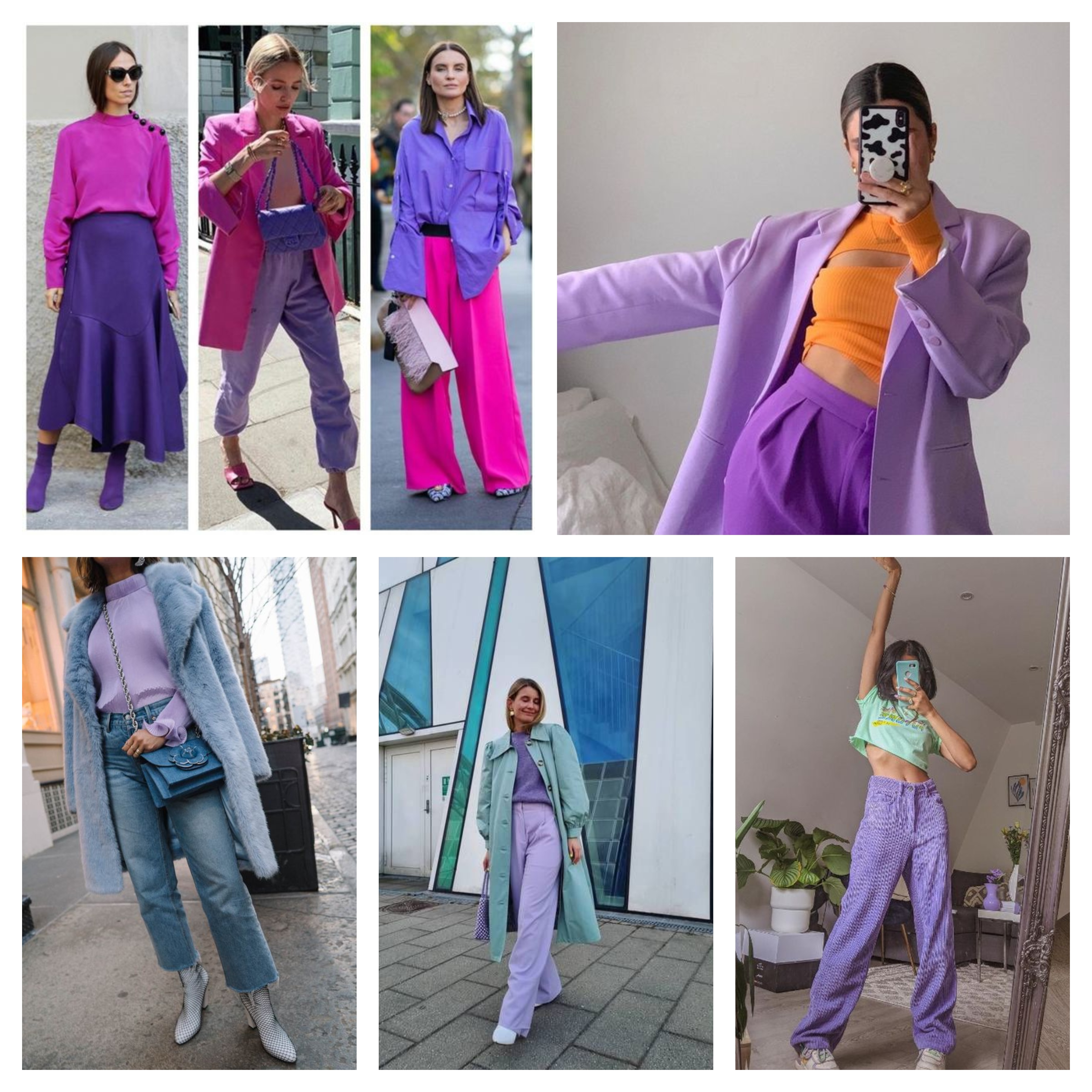
So what do you think about Pantone pick for 2022? Yay or Nay? Comment below and let me know.
Thanks for stopping by.
XoXo,
Source : Pantone

 My name is Iris, and I am a Certified Style Coach™. I am here to assist you in building confidence, enabling you to achieve and consistently enhance the best version of yourself every day.
I always like to see the color of the year, Great post with great color groups.
I have always love the periwinkle color. It goes with any color palette. Thanks for sharing these color groups, to provide inspiration for outfits. It’s interesting to see how very peri can complement a range of color palettes.
C’est super intéressant, merci beaucoup ça nous permettra d’être toujours très tendance 😘 je suis d’être une de tes fan😍 #lamoumous
Hi, Moumou – Periwinkle is one of my best colors but I usually can’t find it. So it’s great to have it be color of the year. I’m looking for new articles of clothing in periwinkle blue to collect this coming year. Your color combos are awesome; so many that I never thought of putting together…very inspiring. Thanks! – Angie, http://www.yourtrueselfblog.com
I love this beautiful shade of purple! I really like purple pieces but they can be hard to find in stores! i need to keep an eye out for when more of this colour starts becoming available in clothing!
Thanks for joining the #WeekdayWearLinkup! Hope that you are having a great weekend 🙂 Another hot one here!
Love Very Peri and I enjoyed your guide to colours to wear with it, and seeing it on the catwalk. Thanks for linking!